Please view this website on a desktop or laptop for the best experience.

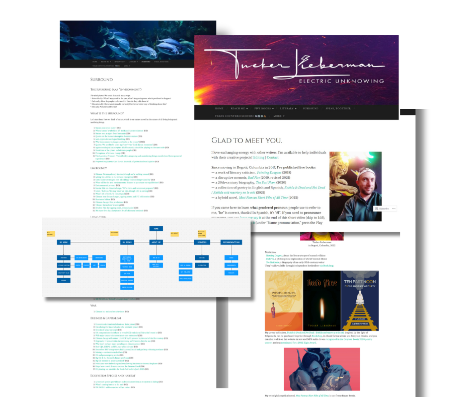
Tucker Lieberman is an author and editor with a prolific body of literary work. He reached out because his website felt more like an archive than a home — dense, dated, and disconnected from his presence. The challenge was to design a digital home that reflected the depth, clarity, and range of his voice.
I started by a full content audit: reading, sorting, and stripping back what no longer served. I created a new sitemap from scratch, simplifying pathways, consolidating scattered blog posts, and aligning the architecture with how readers would naturally explore his work.
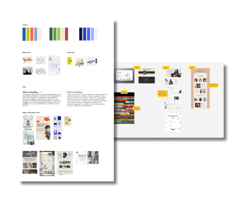
I shaped a brand identity that felt honest to Tucker's personality. I gathered references, started pairing editorial typography with a soft sepia palette and calm, open layouts.
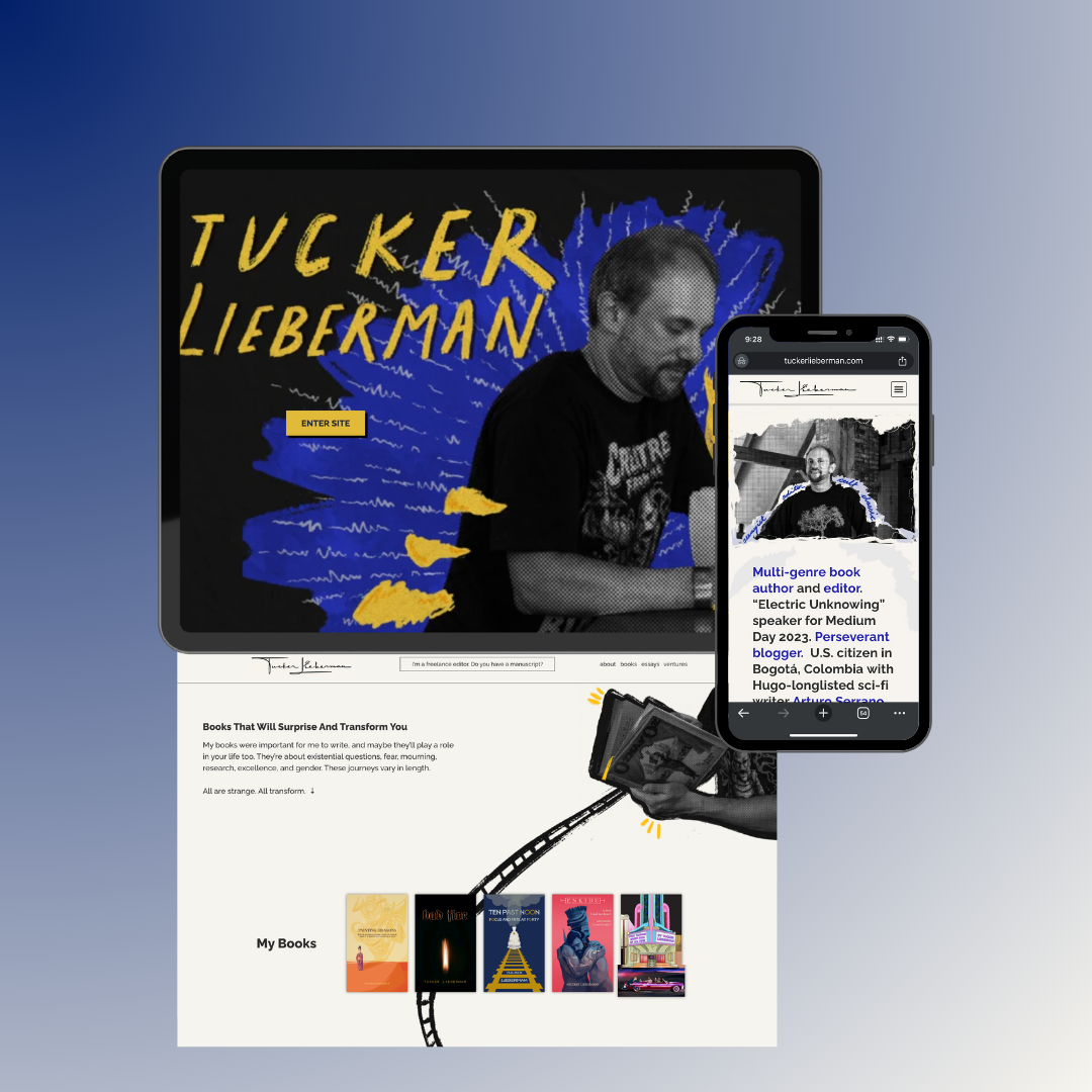
I designed a website that felt like a curated reading experience. Responsive, spacious, and free from clutter. With simplified navigation, intentional pacing, and clear calls to action, it now supports discovery and reflects the depth of Tucker’s work across genres and languages.
Vaishnavi built me a beautiful website that represents who I am. Now, people feel more invited to look at my cool stuff and stick around to read if they wish. She looked at my website and talked to me about my goals. She listened. I am so glad I reached out to her.
Tucker Lieberman, Author & Editor